Aktypi
21.03 – 10.05 / 2014
Galerie Emmanuel Hervé, Paris
There is every reason to consider Camilla Oliveira-Fairclough’s pieces from afar, in order not to loose sight of their limits.
Respecting the necessary distance, somewhat resisting the urge to plunge, one comes to terms with the fact that these pieces do not add nor suppress anything to the world around them; rather, they are simply a part of it, borrowing from it almost anything remarkable that may occur within, according to the eye of the artist – giving us another vision of it while stimulating the confusion of our artistic conceptions.
And for this, the form of the work is useful: the painting as a signboard that attracts attention.
Thus, the wall that will host the painting should not be painted in the same color. It must denote, just as the colors within the painting. No shading (or only exceptionally), a rather straight stroke, and within the canonic form of the painting, simple shapes.
And yet, this is precisely when things get complicated.
Because first of all, the term ‘form’ that so slyly, yet so predictably invited itself here, takes on two meanings. The so-called canonic form can be assimilated to a genre, a regrouping of potentially distinct individuals who nonetheless must share some common features: it is through this form that genre can be acknowledged. As for the so-called simple forms, they no longer are so simple anymore; being overly so – too simple or too formal – they don’t look like anything: at best, they differentiate themselves! It is the case with geometrical forms. The square is not much different from the rectangle or the diamond, but it cannot be mistaken for a circle; thus, it is defined through its proper features (four equal sides perpendicular by pairs) and through the features that differentiate it totally (those that indeed m ake it so different from the circle).
And why would everything get so complicated in the end, when things seem so simple in appearance? Here is an example.
Three superposed triangles painted in green form a schematic Christmas tree: when looking at the figure from which Camila Oliveira Fairclough made a painting with an enigmatic title, not being fond of italics: ^^^, 2007, one could say that the pine tree has inspired the invention (!) of the triangle — that in itself characterizes of a certain way to look at things!
In the world around us, however, there is more than just trees; there are also works of art. Why would Camila not borrow her inspiration from them? Volpi, Daniëls, Palermo, sources are claimed. And then there are the breeding grounds, rather mixed indirect references to Closky, Cointet, Rothko, van Golden…
There are also words between the world and us. It is hard to do without them, hard to avoid them. This indexation of the world in language, the artist yields to it, pushing it to the absurd by organizing her personal Internet site in alphabetical order.
At the letter A, one can see the words apéritif, archive and atelier, titles to three pieces painted in 2010: the lettering is perfectly readable in the first one, disorderly painted in the second, and upside down in the third.
At the letter Z, … the letter by the same name, with the oblique bar mixing with the ascending diagonal in the eponym painting, and the upper and lower horizontal bars with the corresponding limits of the frame; maybe a disrespectful homage to Noland or to an even cleaner minimalism confining to the aesthetics of logotypes. Painted in 2006, Z, or when chronology and alphabetical order don’t match.
From A to Z, we encounter all kinds of things and people, Chloé, 2011, Claire, 2012, Denise, 2012, Rosa, 2012, and even two figurative paintings with vegetal motifs: a deflowered plant, Jacinthe, 2003, and a branch of Lichen, 2003.
Comparable to specimens removed from somewhere – in the field of nature? Hard to believe –showing their strangeness on a white background, this time edging onto a pharmaceutical aesthetics inspired by white coats, each painting can be seen as a spare part of a more complex organism, as a letter taking on its meaning by forming a word that will belong to everyone, as a painting calling on to the next, … Just like most oeuvres are built, piece after piece.
For her first exhibition at Galerie Emmanuel Hervé, Camila Oliveira-Fairclough chose to gather three or four paintings clearly manifesting her reluctance to forge (or rather to capture) a style, and to stick to it (and thus possibly to become captive of it).
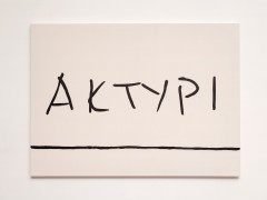
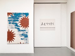
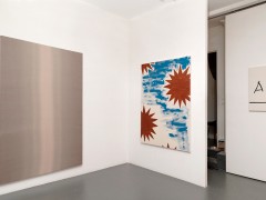
First, why aktypi? Because, even if a number of French-speaking Scrabble players admit up to 305 words, and up to thirty 6-letter words, comprising the letters K and Y (including plurals and conjugated forms), the presence of that pair is rather remarkable in our language. Only one word in French includes all the letters in aktypi, a scientific term, heavily charged with exoticism: the word kényapithèque, the name of an animal, a fossil, even! We all feel ill at ease when pronouncing unknown words or last names for the first time. As long as we haven’t gotten close to the meaning of the former, or met the person bearing the second, or at least someone who might know that person, as long as we have not been able to get a sense of their activities – whether that person is a market gardener or a philosopher —, these strange constructions of letters are but “trinkets of sound futility” and graphic eccentricity. Now, this painting that lends its title to the exhibition relates to that common experience, and it is significant that it reproduces a signature found in another exhibition’s Guest Book. We could search for plastic similarities between the works of Camila Oliveira Fairclough and Guy de Cointet to no avail; yet both artists seem to have a similar disposition for pilfering and recycling; Cointet was particularly fond of exotic toponymy.
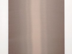
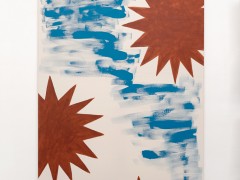
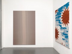
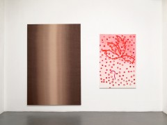
Next to this voluble painting, painted in a strange Greek- or maybe Amazonian-sounding idiom, we should find two others more taciturn paintings. Of equal size, these two could very well be ready-mades, if the artist had not “repackaged” them by stretching decorative hangings printed with abstract décor over the frame. Just imagine a monochrome shading (here is the exception!) or motifs without motifs, kind of. Imagine Ruscha, lying down on the side suffering from a stiff neck and painting a horizon from which he would escape by gravitation, a vertical and crepuscular horizon!
As I write these lines, Camila still wonders whether she should show this diptych that she did not paint. The series is an occurrence in the history of style, we understand.
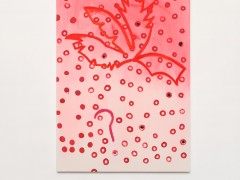
The space of the gallery is not big – in order to take the necessary distance, one needs to use imagination, or walk out of the space and look through the window – but some other things could still be added to it. A painting produced the month before the start of the exhibition, for example, a painting fished out by chance from a lively piece of discussion while walking on the street: a painting painted with… feet and ears!
Frédéric Paul
Translated by Frédérique Destribats


 Home
Home
